Art Licensing, Wood Product Ideas for #MATS Home Decor 2022
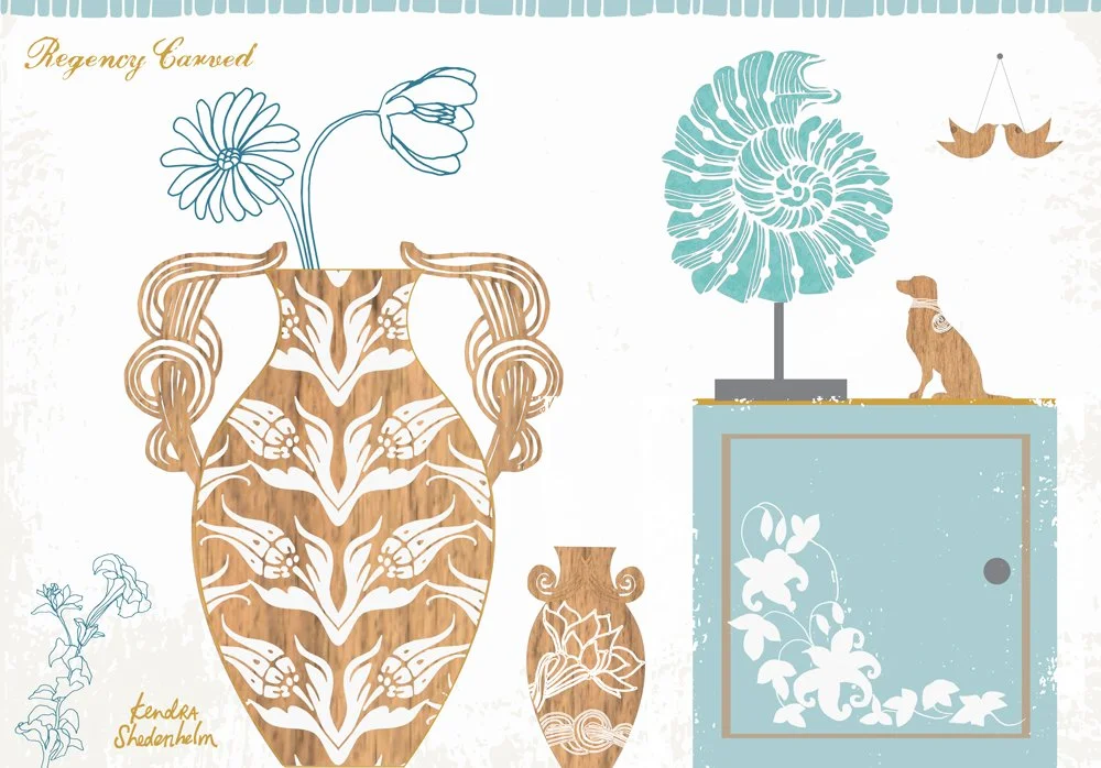
For this week’s assignment for #makeartthatsells Home Decor,
I used the linework and brushed ink drawings from my “mini” assignment and tried to create carved and inlaid textures in wood.
The little wooden dog figurine is my favorite. (:
Make Art That Sells, Home Decor 2022, The Beginning
Week One of the Make Art That Sells Home Decor class!
This was an attempt at creating metal products with a focus on birds. I created a cockatoo with a gem for an eye as a brass lamp base + a laced lampshade (OR maybe a frosted glass lampshade). I also have a painted blue metal bird wall hanging. The bird sculpture can also be on TOP of the ring as a towel holder.
What do you think of these ideas?
Home Decor Plus course with MakeArtThatSells.com
Another course completed for MakeArtThatSells.com with Lilla Rogers and Margo Tantau: Home Decor Plus!
I’ve taken many classes with Lilla over the years, and once again, her style of teaching makes what might seem impossible (creating an entire collection in just a couple of weeks!) into something doable. By breaking creative tasks into bits, Lilla helps me work through an assignment incrementally, piece by piece, before my mind can get ahead of itself and feel stymied. Her courses really keep things moving.
I drew various icons based on our prompt and trend board first…
Some of the icons I drew for the initial prompt. Copyright 2022 Kendra Shedenhelm
And I drew more icons and played around with color…
More drawings and color tests for makeartthatsells.com course, Home Decor Plus. Art copyright 2022 Kendra Shedenhelm
I layered these drawings on various product templates and ultimately submitted this page with a blue texture on white ceramic. I called this collection “Peacock Mashup”.
“Peacock Mashup” collection in textured blue by Kendra Shedenhelm for the makeartthatsells.com course, Home Decor Plus. Art copyright 2022 Kendra Shedenhelm
All of this art is available for further viewing on my agent’s website as well, at wains-world.com. Please reach out with any questions!
Thanks again to Lilla and Margo for another wonderful and helpful class!
Holiday Card Submission for MATS
Another year, another round (or several) of MATS courses!
This year, agent Lilla Rogers of Make Art That Sells offered a free course to the winner of the Holiday Card challenge. The prompt: Favorite Holiday Drink.
Aside from coffee in the morning, my favorite holiday drink is red wine. I wanted to create a cozy, wintry look for this card, with a not-so-dainty glass of red wine.
Drink up!
MATS Bootcamp and The Hierophant
MATS Bootcamp for May was really fun for me.
First, Lilla assigned us the "mini" assignment which had us looking at medieval styles in both art and lettering. I found this super cool site in my search: http://www.bl.uk/manuscripts/, and I drew extensively. (You can check out some of my drawings on Instagram here: https://www.instagram.com/kendrasred/)
The final assignment was to create a tarot card that correlates with our birthday. I'm a Taurus, and my card was The Hierophant. Again, I drew a lot, and then began a collage. This was my final submission...
First assignment with MATS Bootcamp 2016
I enrolled in another year of Lilla Rogers' Make Art That Sells Bootcamp. Previous years' assignments have included creating art for a phone cover, illustrating an online editorial, and making a holiday plate/paper collection. I find that MATS Bootcamp is an exceptional way to try new materials and markets, and the class has really helped to develop my portfolio.
Lilla starts all of her course assignments with a "Mini." This is a just-for-fun exercise, which includes a little research of a given topic and a whole lot of no-pressure creating and experimenting. For this first month's assignment, our Mini was 1920s hairstyles. I found a ton of cool photos online, and I drew and drew. It was a surprisingly inspiring subject for me, and I found myself drawing more portraits in general that week.
After one week with the Mini, we received our full assignment, which was to assemble our drawings and ideas into a faux cover for an adult coloring book. After drawing several faces, hairstyles and patterns, I went with this as my final submission....
Another year of the Lilla Rogers Global Talent Search
On Friday, I submitted my entry for the Lilla Rogers Global Talent Search. This was my third year of creating work for this competition, and it proved to be as challenging and rewarding as ever.
This year, we were given a story about a fictitious young woman who lived in Brooklyn. The brief showed us a picture of her (and her clothing style), where she shopped, where she worked, products she'd buy, products she sold in her shop, the food truck she stopped at, and so on. With this type of person in mind, the assignment was to create a patterned sneaker that she could wear when she bicycled to work. The patterned shoe also needed to incorporate at least one word, hand-written or an actual font.
Although I really liked this approach of getting a visual story about the client, I did find it tricky to create something for a person I couldn't really relate to, while still keeping myself in the art. So I focused on whatever images I was drawn to in the brief.
In her shop, she sold some darker, occult-type of items, so I decided to go with a crow theme. They are one of my favorite birds – strong, smart and ominous, and I knew I would enjoy drawing them.
She also sold some pretty, Parisian-style gifts, which made me envision using a loose, dreamy watercolor style for my pattern.
I drew my shoe template with a sharpie, painted several crows (you can see one of them here), and this is the mockup I submitted, followed by the actual pattern...
Crabs, Lace and Mashups
In Lilla Rogers' Make Art That Sells Bootcamp this month, our mini assignment began with drawing two seemingly unrelated subjects: black & white crustaceans and colorful patterns. After spending a week drawing various crabs and lobsters, as well as creating several floral motifs, we were given our main assignment: to "mashup" the two on a plate.
For many of these assignments, drawing helps me understand the proportions of the subject, but for final art, I tend to want to work in collage. With a photo of a rusty Brooklyn manhole and and a scanned watercolor, I created a chunky crab collage. For my pattern, I went with this lace, which also reminds me of a fishing net and a bubbly shoreline.
In the end, it's not a very successful mashup for me. I love the crab, but it clashes with this one-color lace, and it's visually confusing. I will be trying a version with texture in the lace, and also one with less texture in the crab.
As always, your comments and suggestions are welcome!
My latest MATS poster assignment
Yesterday I completed my April assignment for Lilla Rogers' Make Art That Sells Bootcamp course. We were asked to create a 20x30 poster for her upcoming event, the Global Art Gathering, which is in Brighton on June 12. We were given the MATS color palette to work with, and some required copy, but the rest was pretty open.
The color palette threw me, as I was unable to use textures in a way that I am used to (while maintaining the specified colors). I tried some new techniques in Photoshop to get more texture, but ultimately, I kept it simple and went with this for my submission...
Transferring my collage onto wood
The collage I'd made for this month's MATS Bootcamp really lent itself to a burnt wood look, so I bought a few rounds of wood and a wood-burning tool at my local art store.
Though I really loved sketching with the wood burner, I just couldn't get an even burn for large flat areas. So I found this great Photoshop tutorial, made some additional tweaks, and submitted this final piece:


