Hand-lettering for this week’s class in Make Art That Sells.
I went with a series of antique typewriter-styles of lettering, focusing on “politeness” with varying salutations and RSVPs.
Have a favorite?
Includes my art process, art shows, new ideas, products that are released into stores, artists I admire, and printable art that is free to download (free printable coloring pages, etc.). Your feedback is always welcome.
I went with a series of antique typewriter-styles of lettering, focusing on “politeness” with varying salutations and RSVPs.
Have a favorite?
This was an attempt at creating metal products with a focus on birds. I created a cockatoo with a gem for an eye as a brass lamp base + a laced lampshade (OR maybe a frosted glass lampshade). I also have a painted blue metal bird wall hanging. The bird sculpture can also be on TOP of the ring as a towel holder.
What do you think of these ideas?
Another course completed for MakeArtThatSells.com with Lilla Rogers and Margo Tantau: Home Decor Plus!
I’ve taken many classes with Lilla over the years, and once again, her style of teaching makes what might seem impossible (creating an entire collection in just a couple of weeks!) into something doable. By breaking creative tasks into bits, Lilla helps me work through an assignment incrementally, piece by piece, before my mind can get ahead of itself and feel stymied. Her courses really keep things moving.
All of this art is available for further viewing on my agent’s website as well, at wains-world.com. Please reach out with any questions!
Thanks again to Lilla and Margo for another wonderful and helpful class!
At the Atlanta Market this past January, more of my Watercolor Animal collection was launched — pillows! Thank you, Creative Co-op!
I received a couple samples, and they look great. Excellent quality pillow, too. Yep, stoked again.
I really enjoyed creating this piece for last week's Illustration Friday's challenge, and I was stoked that I was able to submit again this week. This week's theme: "Tropical."
I haven't worked with birds lately (possibly my favorite subject ever), so I decided to focus on tropical birds. I looked through various images, and considered a flamingo collage, but then I found a beautiful shot of a toucan. Below is my collage inspired by that photo...
Yesterday, I remembered to create an illustration for Illustration Friday's weekly challenge. The word was "Heart." Here are a couple collages I came up with...
I thought I'd forever be a Pigma Micron and Sharpie marker person, but I've found a new love: the Copic sketch marker. The brush side moves so smoothly on the paper that it feels like it's leading my sketches, and I've found myself drawing a lot more the past few days...
As I wrote in my last post, I'm taking another Make it in Design course with Rachael Taylor this summer. My previous post was about my intermediate track submission, but I also submitted to the advanced track.
The advanced assignment focused on "Past Modern," with keywords like ornate, ornamental, geometric, and laser cut. Although I initially spent my time drawing floral elements (which I've done plenty of in the past), I decided to try some geometric shapes in Illustrator, and I ended up with a whole new group of work that I really enjoyed creating.
Below are several of my new patterns, both ornate/floral and geometric (top left was what I'd submitted for the final online gallery)...
I've been illustrating one of my favorite foods this week for M Delish Boutique's new sauce labels: peppers. I LOVE peppers.
Here are my latest creations for her pepper sauce labels, Chipotle Adobo and Red Tsunami...
I've been wanting more practice with textile designs lately, so I spent a chunk of time this week turning my recent floral sketches into patterns.
After scanning my ink drawings, I opened them in Illustrator and used the Live Trace function to turn them into vector art. I then brought all the vector elements into InDesign, mixing and matching one drawing with another, to assemble the designs.
I scanned in pages from West Elm and Crate and Barrel, and I used InDesign's eyedropper tool to create swatches of colors from the images. Then I tested out various background colors for my patterns using these color combos.
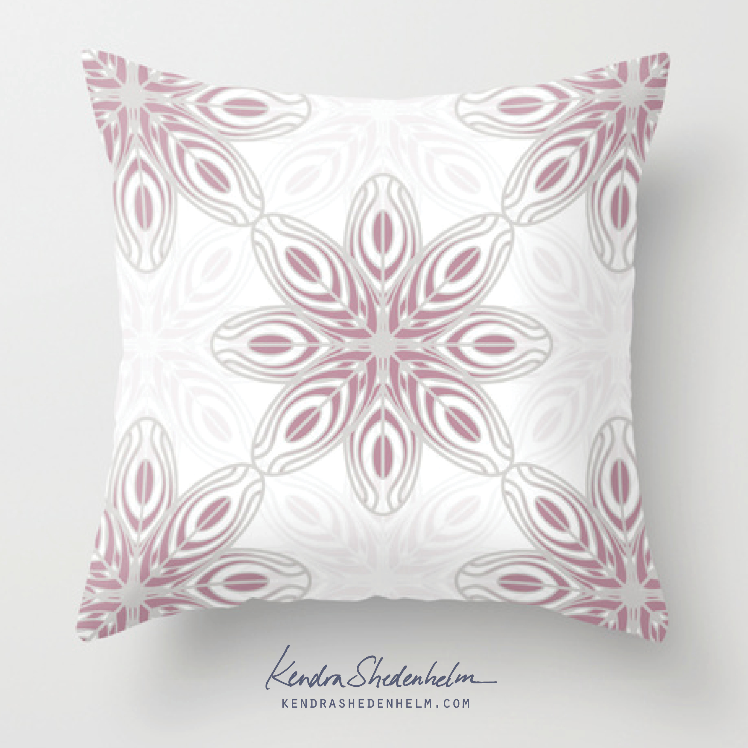
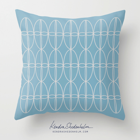
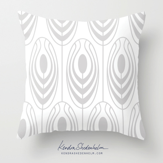
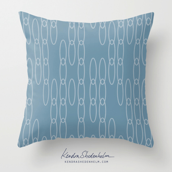
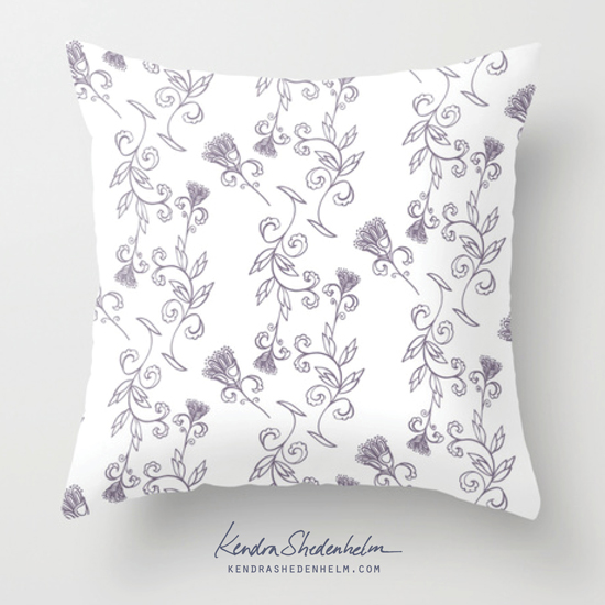
Here are some of the final patterns, as mocked up in my Society6 shop: