Loving my new Copic marker

I thought I'd forever be a Pigma Micron and Sharpie marker person, but I've found a new love: the Copic sketch marker. The brush side moves so smoothly on the paper that it feels like it's leading my sketches, and I've found myself drawing a lot more the past few days...

Sketching in the car, while waiting to pick up the kid at camp

Bird sketch, merely because I saw the Copic marker and I couldn't not pick it up

Floral sketch to warm up for summer school class

Geometric Patterns for summer school 2015

As I wrote in my last post, I'm taking another Make it in Design course with Rachael Taylor this summer. My previous post was about my intermediate track submission, but I also submitted to the advanced track.

The advanced assignment focused on "Past Modern," with keywords like ornate, ornamental, geometric, and laser cut. Although I initially spent my time drawing floral elements (which I've done plenty of in the past), I decided to try some geometric shapes in Illustrator, and I ended up with a whole new group of work that I really enjoyed creating.

Below are several of my new patterns, both ornate/floral and geometric (top left was what I'd submitted for the final online gallery)...

Summer school with surface patterns and design, intermediate track

I am again taking summer school with Rachael Taylor's Make it in Design (I took the course last year as well and blogged about it here and here). Since it's only a couple assignments, I enrolled for both the intermediate and the advanced tracks this time.

For the first intermediate assignment, we worked with an "organic decay" theme. I love rusty and chipped textures, and I use them in most of my collages, but I'd never really considered creating printed textiles with them.

I tried a few different styles, but I submitted this rusty orange one on top. Although I'd be more inclined to wear the black-splash texture below it, I felt the orange would stand out more as a thumbnail in the online gallery. I've attached a few more ideas as well.

I'd love to hear what you think. Comments are always welcome.

Editorial illustration for Girls' World magazine

My editorial illustrations for Girls' World magazine are now in stores! I am beyond thrilled. I love the story by Sona Charaipotra, the images look great in print, and working with the art director couldn't have been better. It was an excellent first experience in editorial illustration, and I look forward to many, many more.

This was our final month for Lilla Rogers' Make Art That Sells Bootcamp, and the assignment was to create a 7x10 horizontal illustration for this article: "How To Succeed At Becoming A Digital Nomad" by Tanya Mohn.

I wanted this one to be simple and graphic, and I went with a silhouetted style to show the layers of landscapes that a digital nomad has the freedom to work in...

Kendra_Shedenhelm_MakeArtThatSells_LillaRogers_Bootcamp_Digital Nomad

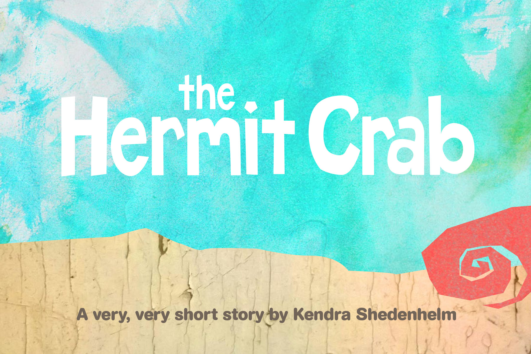
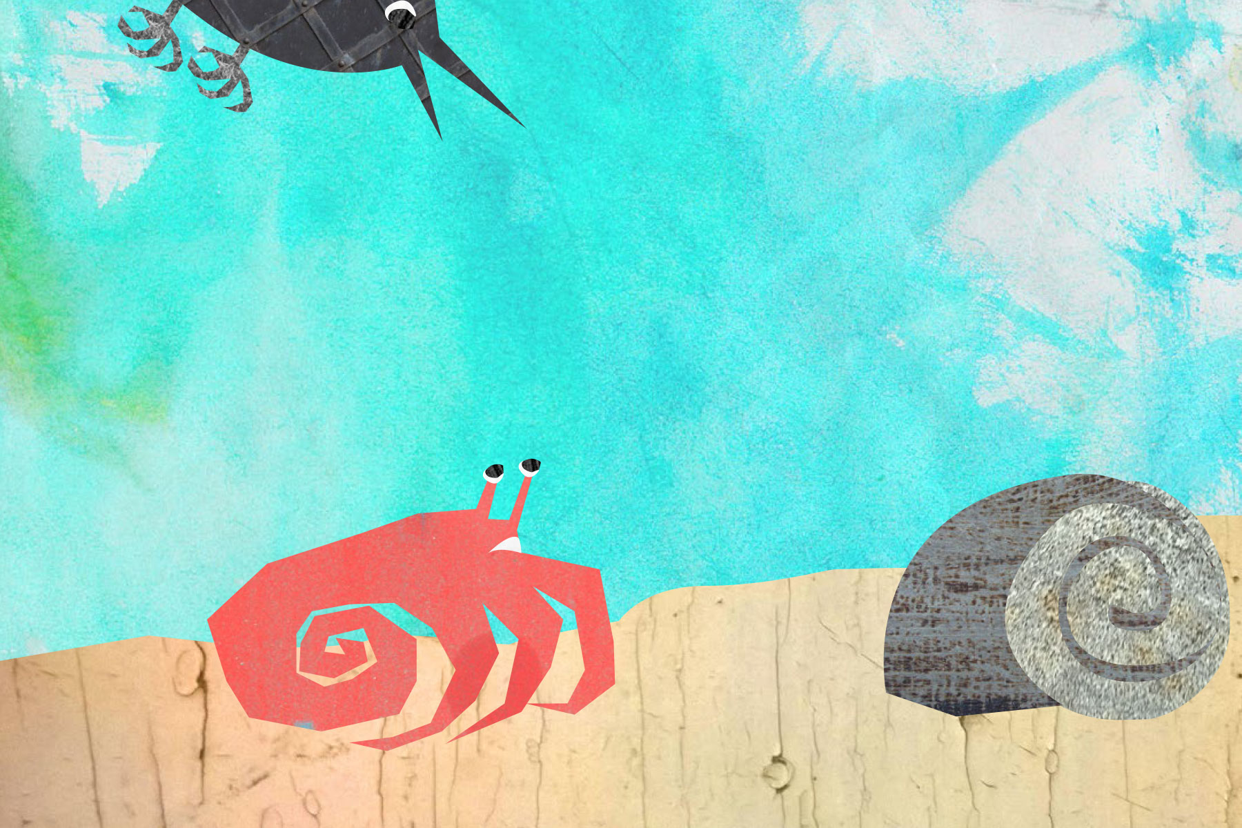
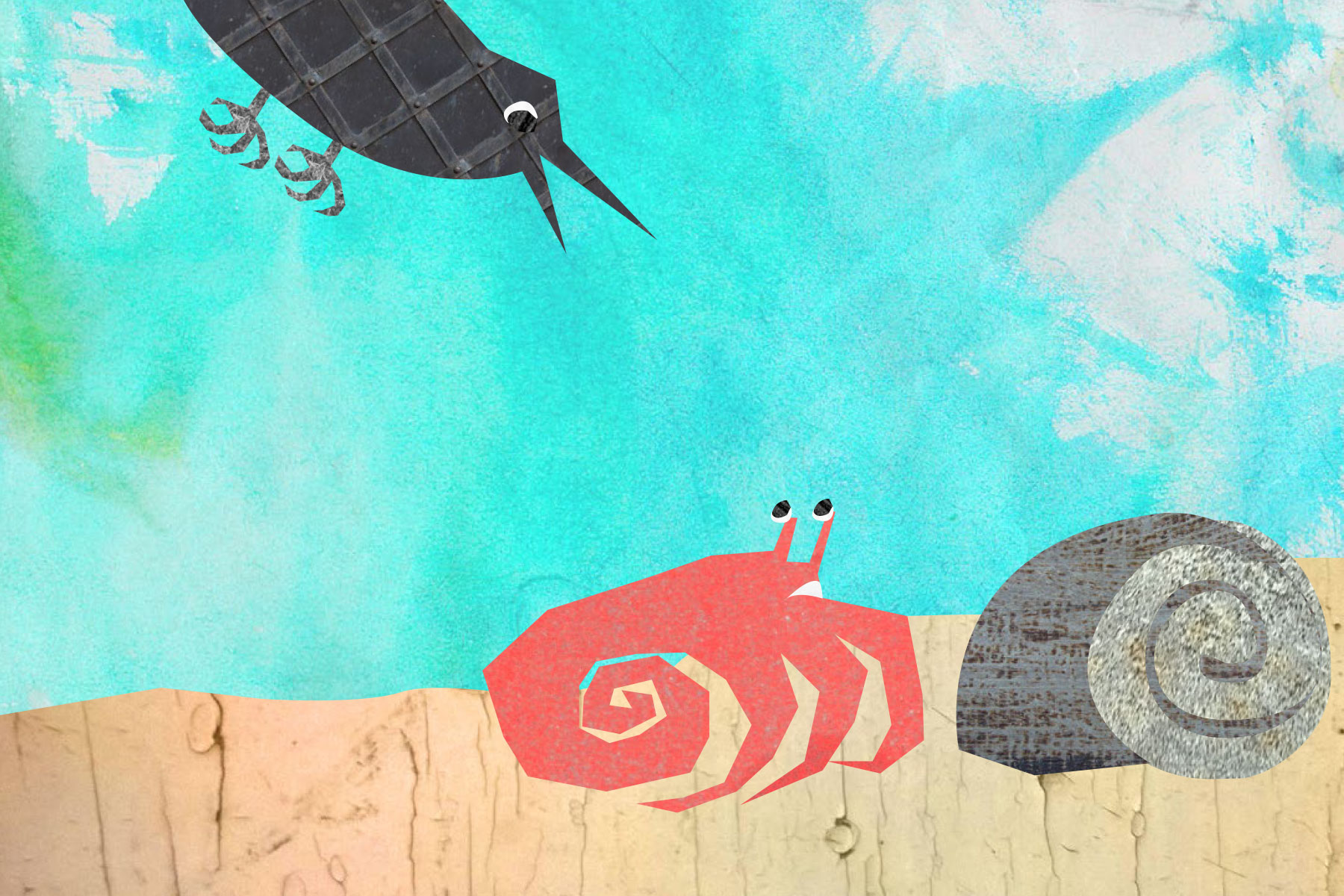
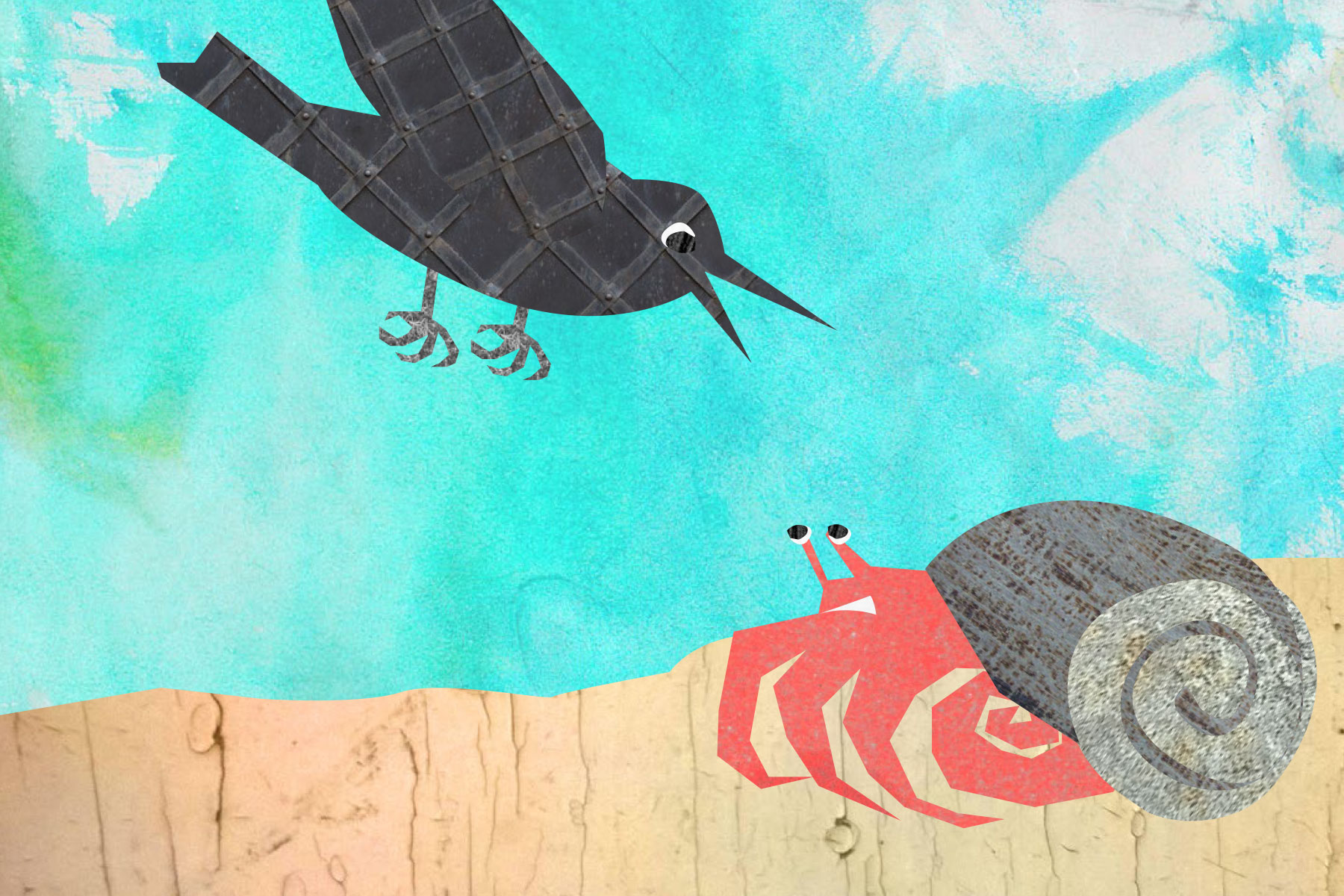
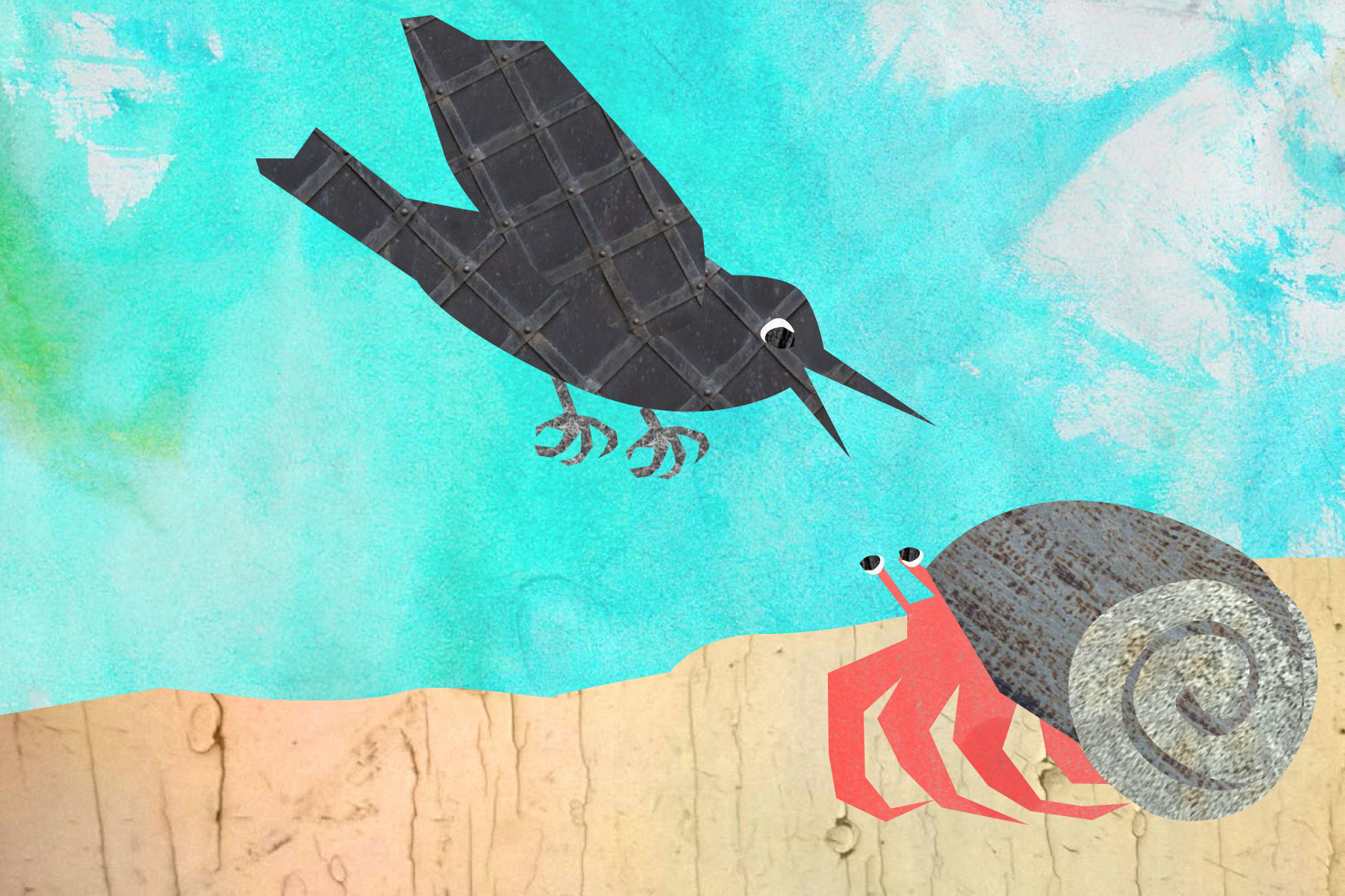
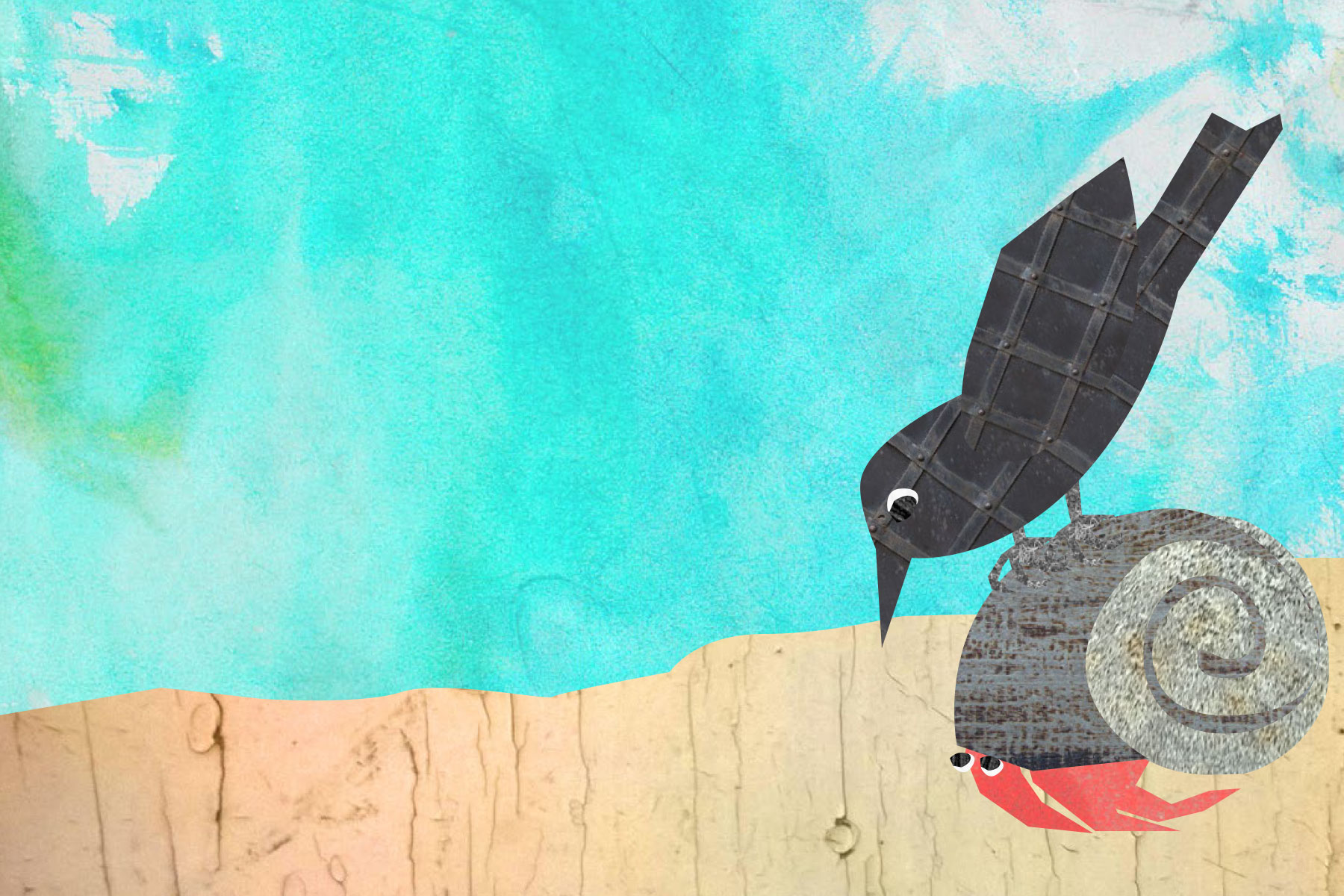
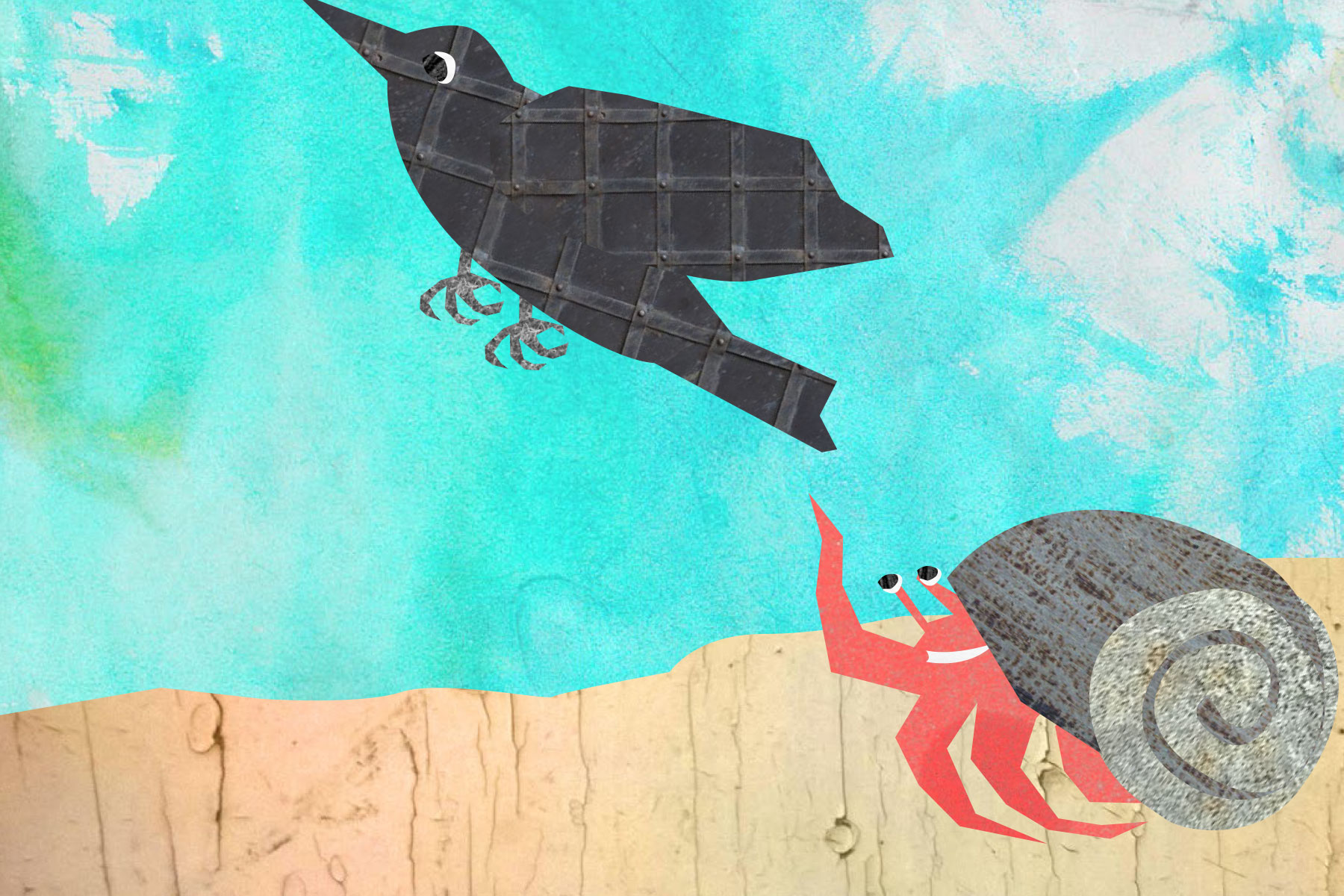
A tiny picture book about a hermit crab (and collage)

I'll be giving a short presentation about illustration and collage to my son's first grade art class today. I plan to bring random textures and objects, my scissors, a glue stick and improvise a little story with their help. The first graders have been learning about hermit crabs for the past few weeks, and they were also required to create their own stories about them, so I will start by cutting out a main character of a hermit crab. From there, I'm hoping the kids can help me shape the story.

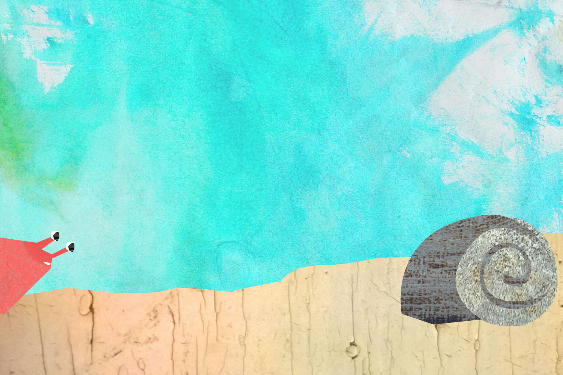
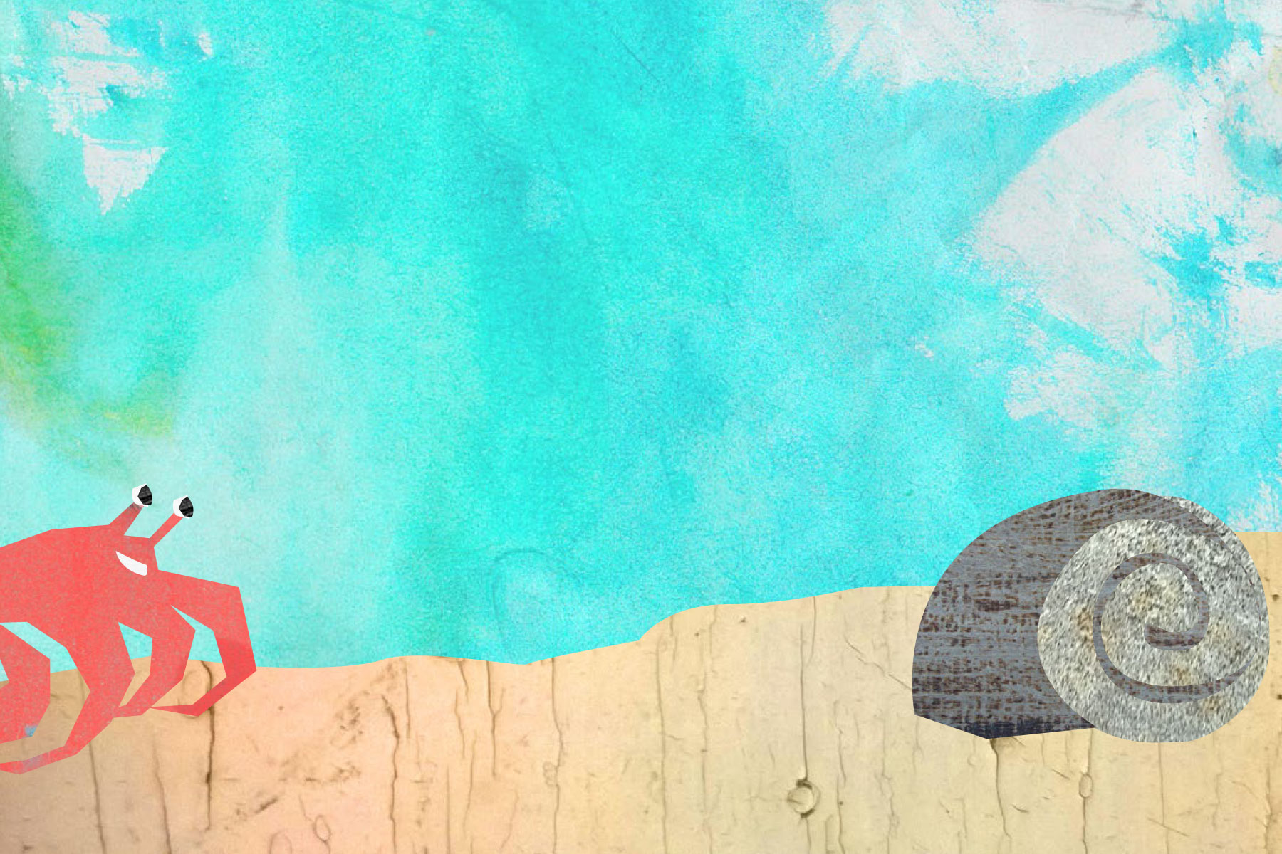
My main goal is to show them the fun (and freedom) of constructing a tale with collage – that with simple shapes they can create a character. And by changing elements slightly (eyes looking up or down, changing the mouth shape, moving the character forward), they can even create action and emotion. 

Just in case my improv presentation is a total flop, I also created a takeaway booklet for the students, so they can see the potential of illustrating in this way. This is the takeaway booklet below. If you'd like to download a free PDF, please feel free to do so here. (Please just link back to me if you reference it, and let me know what you think!)

New floral sketches and drawings

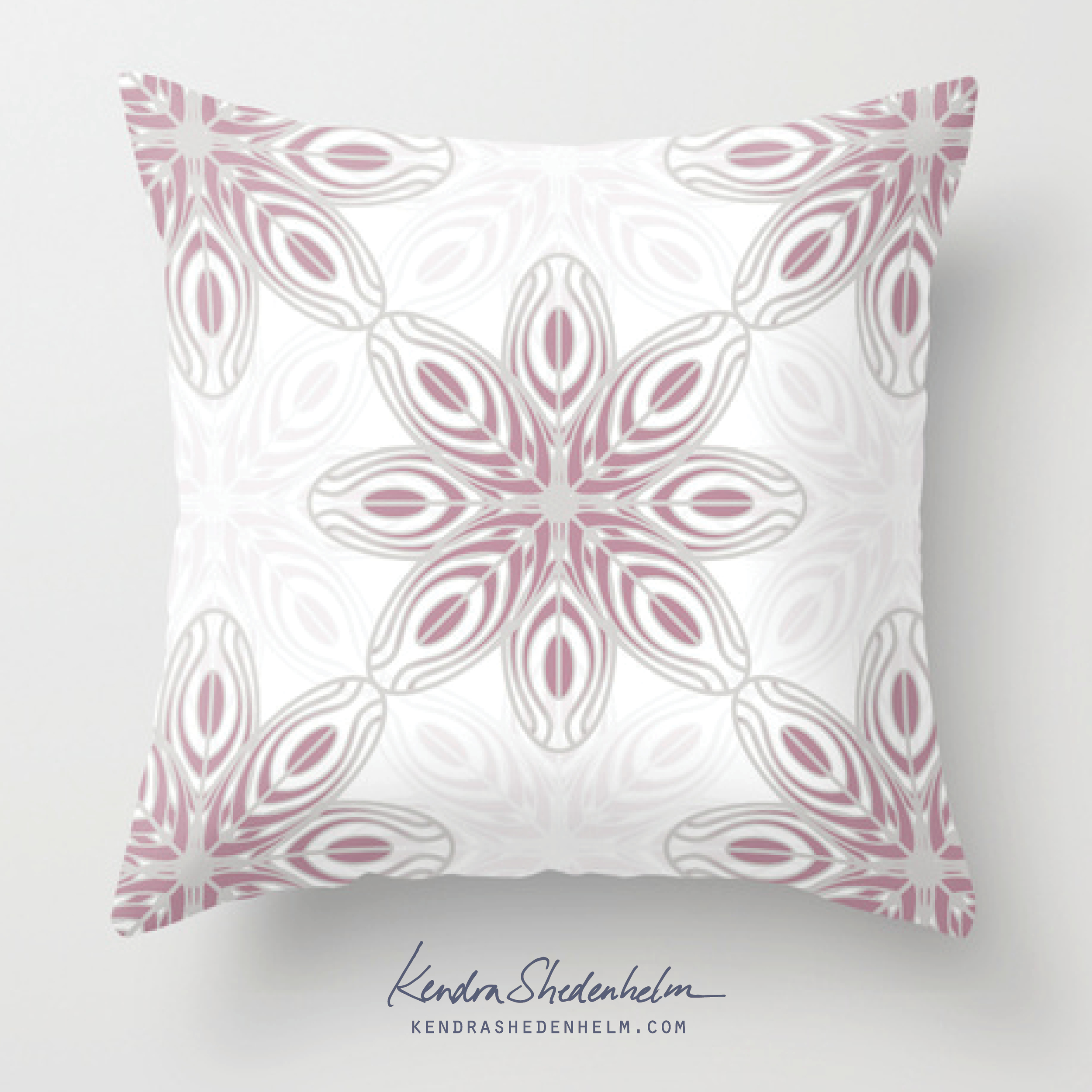
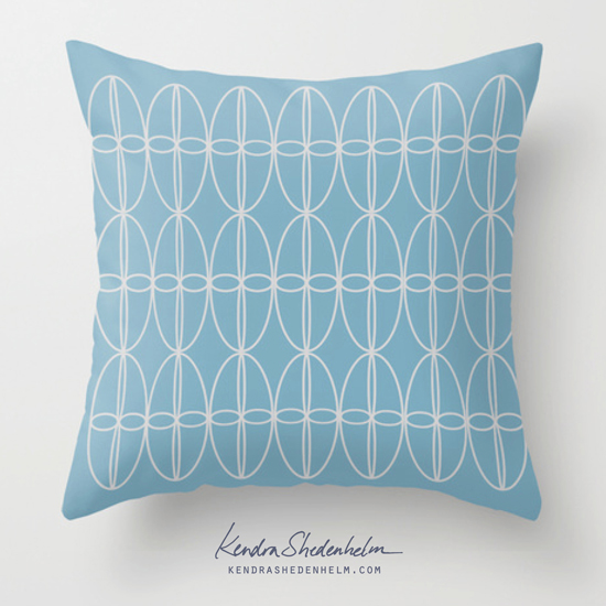
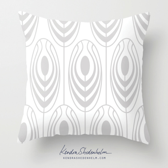
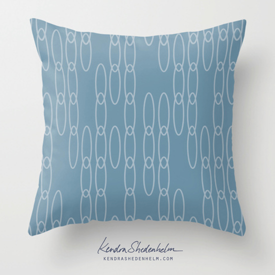
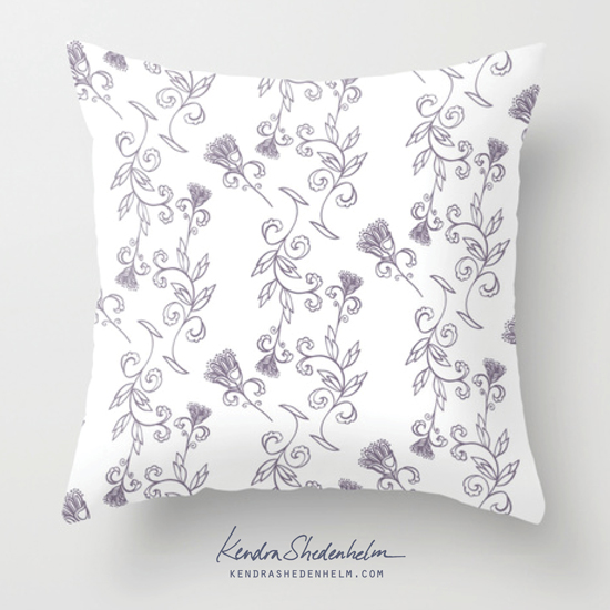
I've been wanting more practice with textile designs lately, so I spent a chunk of time this week turning my recent floral sketches into patterns.

After scanning my ink drawings, I opened them in Illustrator and used the Live Trace function to turn them into vector art. I then brought all the vector elements into InDesign, mixing and matching one drawing with another, to assemble the designs. 

I scanned in pages from West Elm and Crate and Barrel, and I used InDesign's eyedropper tool to create swatches of colors from the images. Then I tested out various background colors for my patterns using these color combos.

Here are some of the final patterns, as mocked up in my Society6 shop:

Crabs, Lace and Mashups

In Lilla Rogers' Make Art That Sells Bootcamp this month, our mini assignment began with drawing two seemingly unrelated subjects: black & white crustaceans and colorful patterns. After spending a week drawing various crabs and lobsters, as well as creating several floral motifs, we were given our main assignment: to "mashup" the two on a plate.

For many of these assignments, drawing helps me understand the proportions of the subject, but for final art, I tend to want to work in collage. With a photo of a rusty Brooklyn manhole and and a scanned watercolor, I created a chunky crab collage. For my pattern, I went with this lace, which also reminds me of a fishing net and a bubbly shoreline. 

In the end, it's not a very successful mashup for me. I love the crab, but it clashes with this one-color lace, and it's visually confusing. I will be trying a version with texture in the lace, and also one with less texture in the crab.

As always, your comments and suggestions are welcome!

My latest MATS poster assignment

Yesterday I completed my April assignment for Lilla Rogers' Make Art That Sells Bootcamp course. We were asked to create a 20x30 poster for her upcoming event, the Global Art Gathering, which is in Brighton on June 12. We were given the MATS color palette to work with, and some required copy, but the rest was pretty open.

The color palette threw me, as I was unable to use textures in a way that I am used to (while maintaining the specified colors). I tried some new techniques in Photoshop to get more texture, but ultimately, I kept it simple and went with this for my submission...

Glazing bowls for the Empty Bowls fundraiser

Although we moved out of Brooklyn almost two years ago, I was thrilled to be able to participate in Bay Ridge's annual Empty Bowls fundraiser again, which is coming up on May 2nd. I didn't make it to the Brooklyn glazing party, but I went to a nearby DIY shop, had these fired there, and just shipped my bowls to the event.

We recently lost an incredibly special little girl in our community, and my son has been frequently asking questions about the afterlife. These questions were on my mind too when I glazed these bowls, and I've tried to incorporate a feeling of expansion and optimism.

Transferring my collage onto wood

The collage I'd made for this month's MATS Bootcamp really lent itself to a burnt wood look, so I bought a few rounds of wood and a wood-burning tool at my local art store.

Though I really loved sketching with the wood burner, I just couldn't get an even burn for large flat areas. So I found this great Photoshop tutorial, made some additional tweaks, and submitted this final piece: